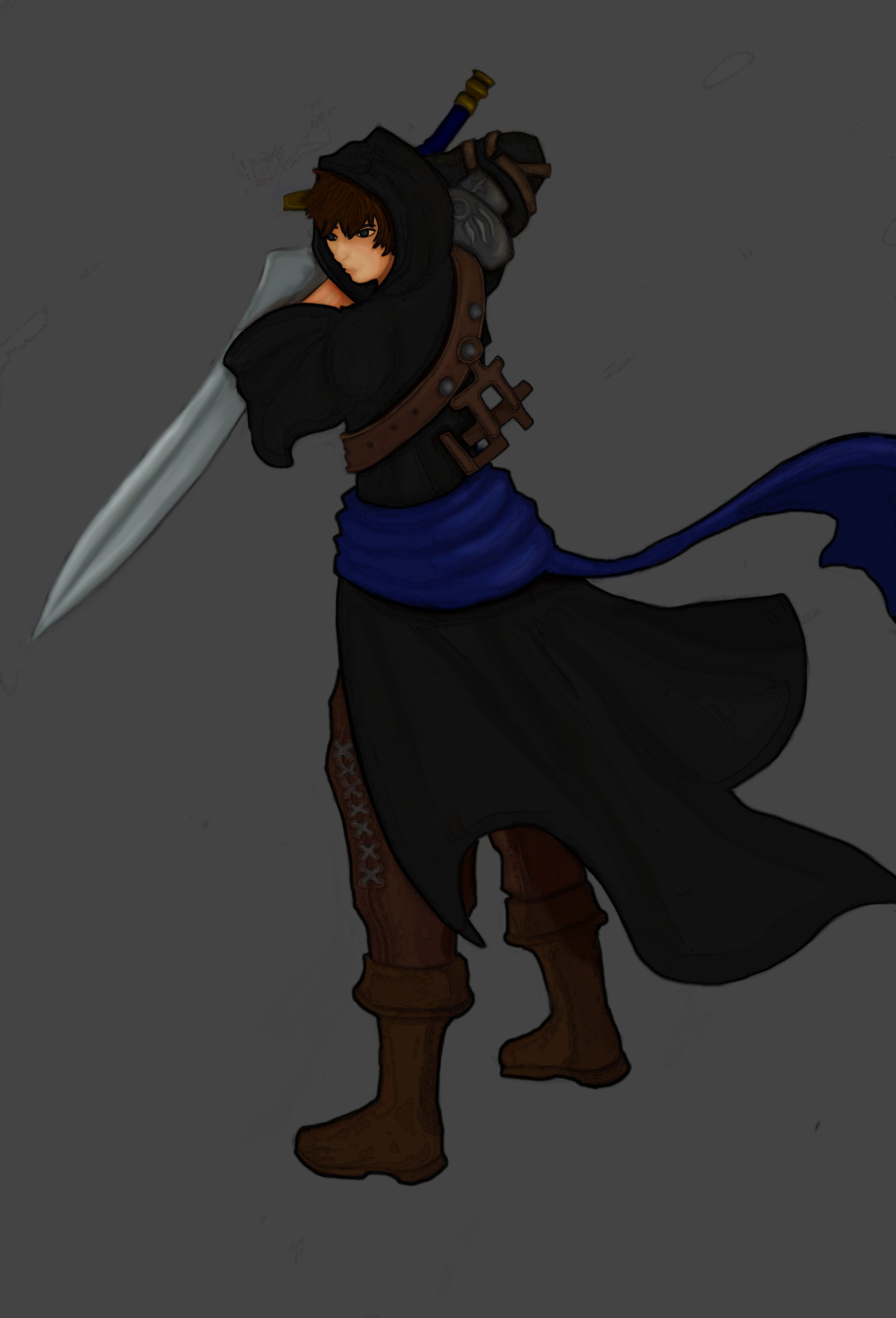
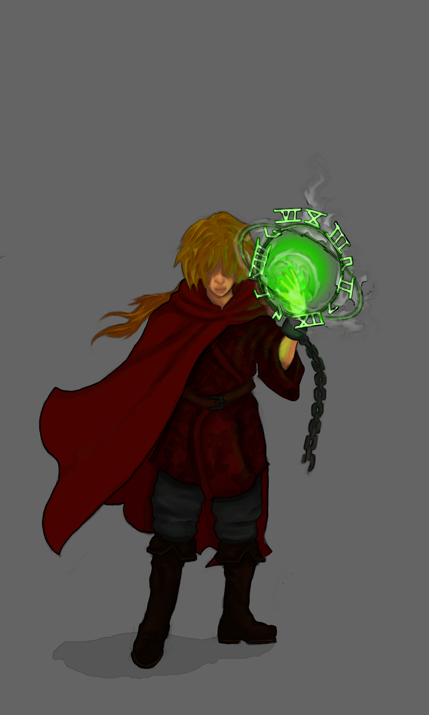
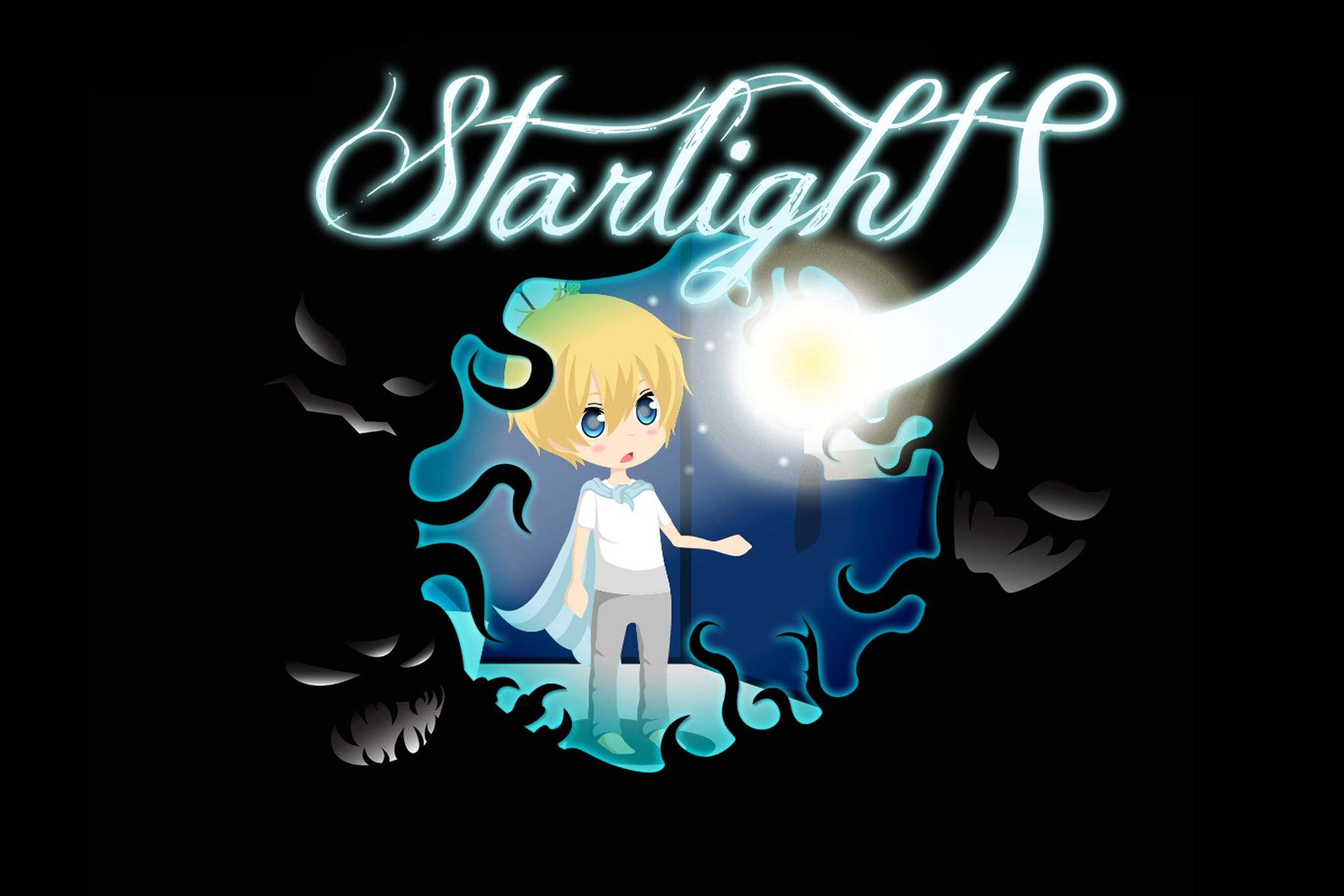
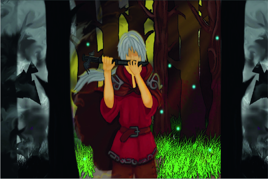
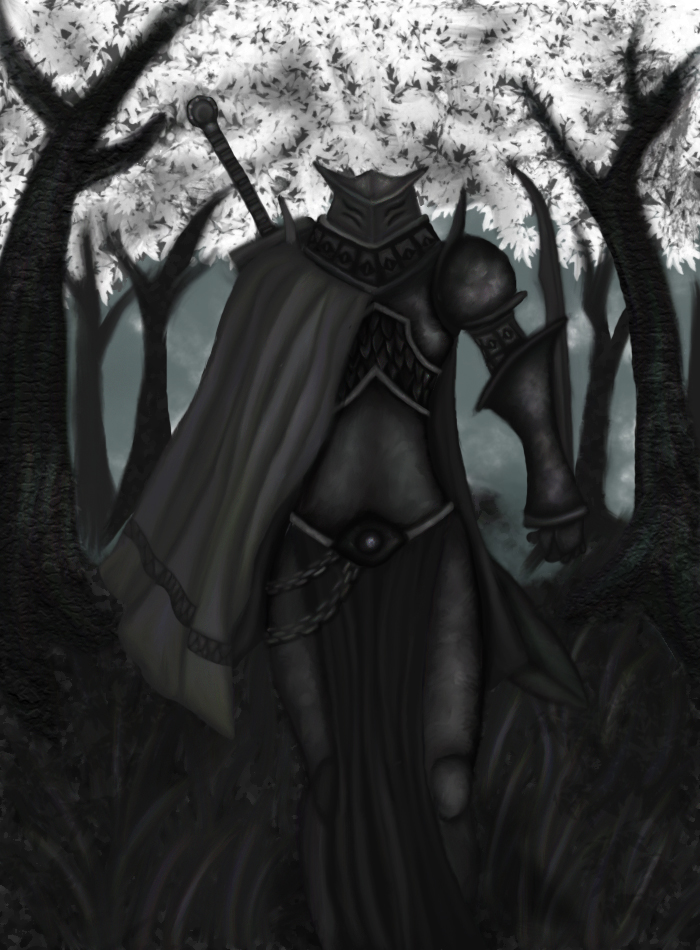
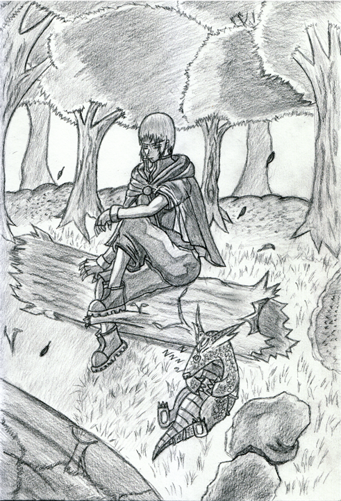
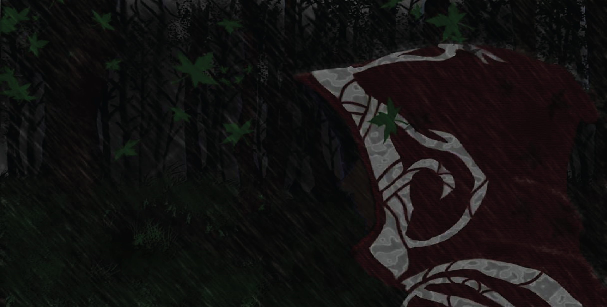
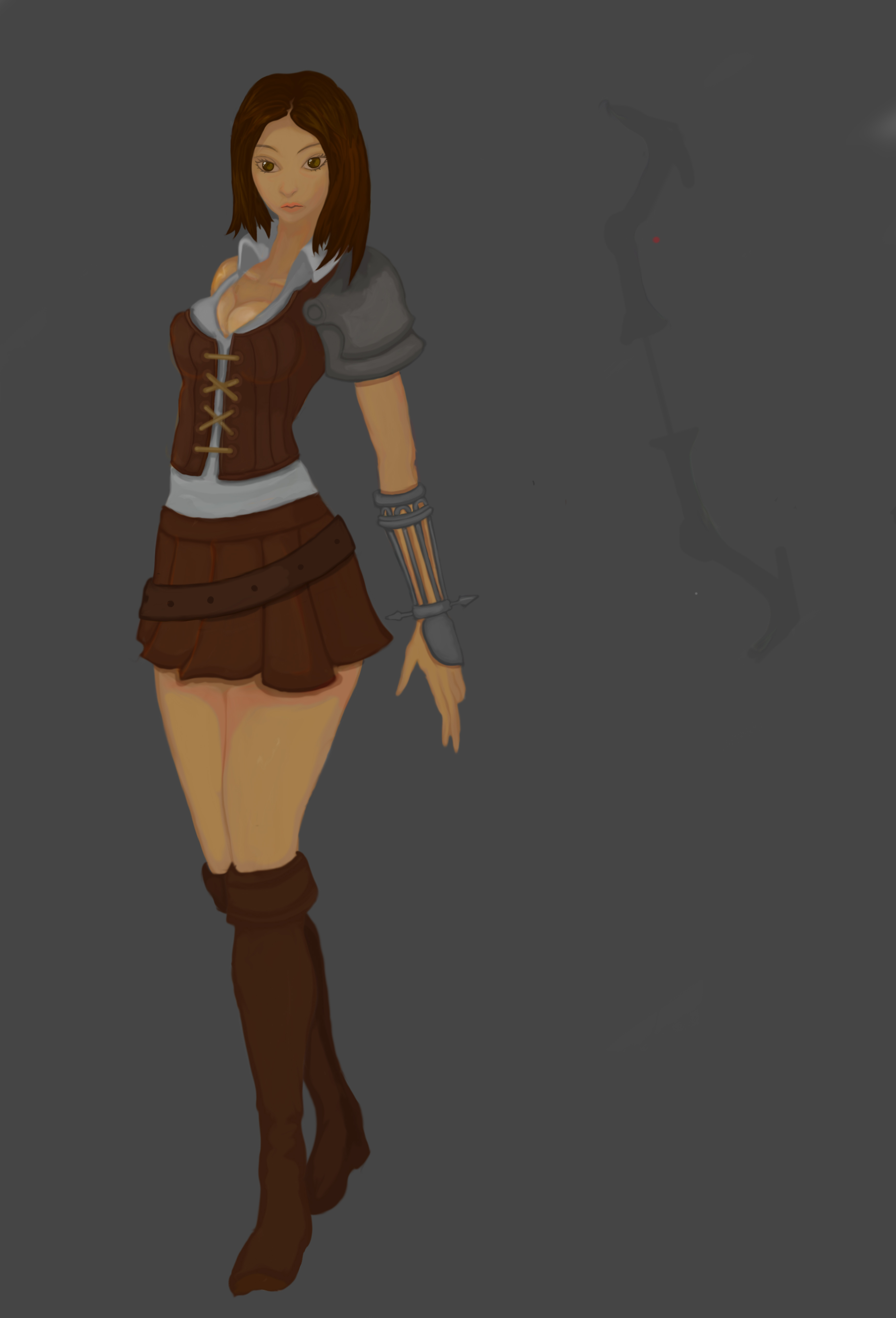
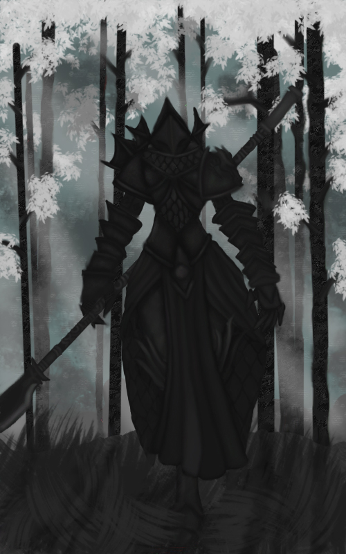
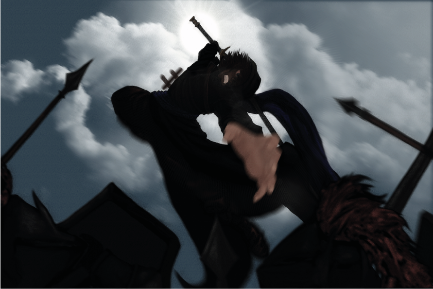
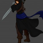
@media (max-width: 768px) { /* Styles for screens 768px and smaller (e.g., mobile) */ body { font-size: 16px; } .some-element { width: 100%; padding: 10px; } } Home About Workshops Games Contact Us A Collection of our concepts from various projects Improved Ryan concept, designed by art director Clarke Lewis
